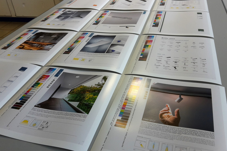
Once it’s in print, a new catalogue that stands proud on the distributor’s counter or a designer’s bookshelf is primarily a complete, finished work. If it’s well designed, you will find it well organised, solid and simple to consult. And this is what it should be: a working tool to help people choose a type of lighting and the relevant products and technical and operational features. All of which is apparently very simple. Yet in actual fact, “producing” a new catalogue is tough work. It’s also fascinating, at times fun, but – seriously – not easy, because there’s a lot more involved than just sending it to be printed.

Let’s take the latest edition of the TECH catalogue. Now that it is in print and smells of fresh ink everything’s fine (at the most we may notice a small typo that escaped even the most attentive proofreading), but if we think for example of all the people involved in it, we realise it was a huge project. Who worked on it? First and foremost the Sales Management in close contact with Marketing and Purchases, then the designers and the Engineering department, the photographer and graphic designers, the printer. So how do we go about it? First we need to analyse the sales figures, understand which products need modifying, and which ones to extend the range of finishes and models of, remove from the range or, even more difficult, create from scratch… In short we need to respond to market signals and requirements, which are often complex and can vary from one location to another. In the lighting industry, a huge number of models need to be offered, especially in the case of a generalist company like Rossini Illuminazione, which has made the extent of its range one of its strengths. The TECH catalogue features many categories: LEDs, wall, ceiling, suspension and recessed luminaires, spotlights, ceiling lights, lamps and luminaires, modular systems and profiles, tracks and cable systems, table and floor lamps, office lights, lighting for outdoors, for the medical sector, the contract industry and so on. And every product, in turn, is available in at least several dimensions, finishes and colours, or even with different light sources (a traditional lamp holder or an integrated LED driver). It goes without saying that organising thousands of references into one printed volume that is easy to consult and provides clear information requires considerable experience, and at the same time we have to bear in mind who will be consulting it, whether professionals (electricians, wholesalers, designers and planners, architects), or end consumers.
The product list often changes from one season to another, in the same way that pre- and after-sales services change. Printed previews may anticipate the main catalogue, as occurred with the June volume, which anticipated the new technical features, or the brochure featuring aluminium profiles and LED strips, which today can be customised down to the centimetre in 16 different types. So the main catalogue will also deal with these topics in depth, following on from the initial level of information. This means constantly working to provide customers with information.
But let’s get back to producing the catalogue: once the difficult job of selecting the products to be featured has been completed, the next stage is photographing them. We need to produce photographic material for the new luminaires and update the photos of products that are being re-proposed with new technical images. Then there are reports of lighting projects that have been developed, which describe where and how a specific model was used. So we need to manage and store thousands of files, not only of photographs, but also of copy (in Italian and English), which the graphic design office will need so that it can finally design the page layout. After the first dummy* is ready, many more will follow, with various types of corrections. The colours of the photographs and colour samples are optimised (if necessary they are perfected after production), corrections are made to the text and information sheets, the page sequence is decided – and will change many times along with the table of contents – before it becomes definitive. The table of contents… or rather the “tables of contents” which along with the introduction form page layout and copy work of their own. Then if it’s a more advanced table of contents, because it provides a whole range of information in the actual classification, you can image how much work goes into it.

The total number of pages must always be a multiple of 4, otherwise the printed material cannot be bound correctly. The last step before it goes to the printing machine is producing a prototype copy called a “blueprint” because before the advent of the digital age it was printed in blue. When the “blueprint” is approved with a nice stamp that says “print approved”, the work goes ahead. During the printing stage, the final result of each page needs to be checked to make sure that the paper reacts properly with the inks, because it may be affected by dry or damp weather. The printed sheets are left to dry and are then sent to be cut and bound using special stitching on the spine. The delivery of a new catalogue is so exciting! But the greatest surprise is managing to keep to the timescale.
And that’s the whole process behind a Rossini Illuminazione or Plexiform catalogue: lots of enthusiasm, lots of effort and of course… lots of light! By the way, stay connected, coming soon another article, which explores the brand new TECH catalogue by Rossini Illuminazione!
*a term used by graphic designers and printers to indicate a draft of the hard copy

 English
 Italiano


